As you may well have experienced for yourself, within just a few seconds of meeting a new person our brains make a snap judgment about them. That judgment may change if you spend time with the person, but your initial impression must be overcome by the new evidence.
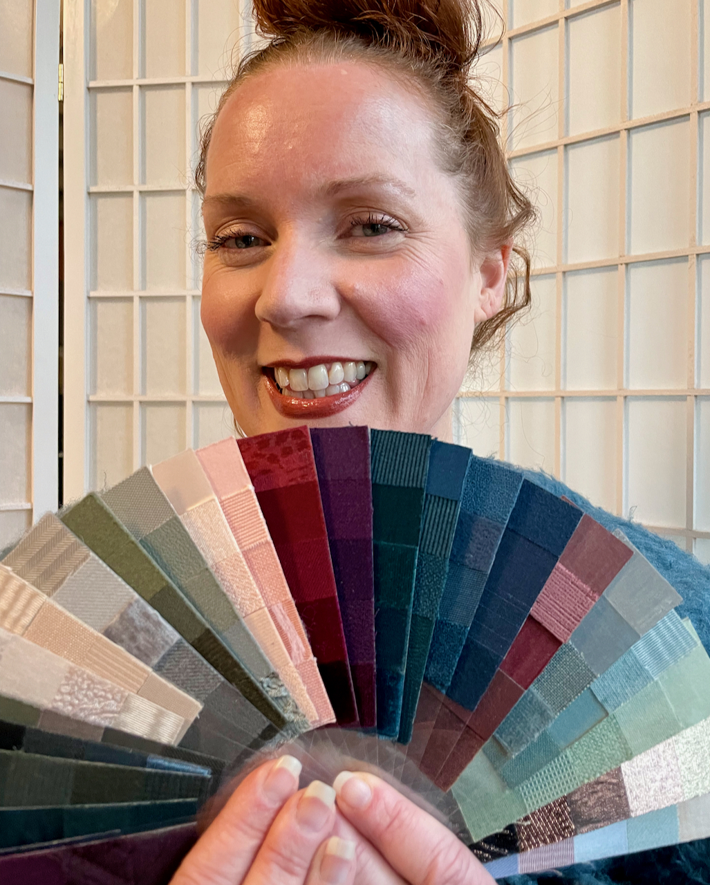
When I ask my color clients what image they’d like to convey to the world, the most common responses are authentic, credible, confident. A custom color palette takes care of authentic and credible, because the palette is based on YOU–your unique combination of skin, hair, and eye color, as well as your personality. When you are seen for who you are, confidence is the result.
But not everyone wants to be seen.
As my color mentor, Olga Kamova wrote,
It took me several years and many observations to realize that “to be seen” is actually a deep and natural fear for many of us… Personal style is like a unique visual imprint. It makes us stand out and, therefore, be seen. Many people feel that they need permission—an outside permission—to stand out. Because when we are seen we are also heard. It is not just a power, it’s also a responsibility. So when a person works on personal style it’s mostly inner work on allowing yourself to be seen.
 Recently I created a palette for a dancer and personal coach who calls herself Trixie Kerfuffle. Her stage name says a lot about how she likes to mix it up, do the unexpected, raise a bit of a ruckus. For example, one of the dance classes she teaches is Burlesque—as a way to freer self-expression.
The woman who arrived at my door was wearing a black leather jacket and boots, and a black top (fringed? feathered? don’t recall). OK!, I thought, this gal will be interesting. [She sent me this “before” photo–not the outfit at our session.]
One thing we aim for as color/style consultants is for who we are to be what people see first, not our clothes. In other words, we want others to say “You look great!” rather than “Love your sweater!” What I saw were Trixie’s clothes.
After spending time with her and watching her palette unfold, it became clear my first impressions were way off. This was an intelligent well-educated woman who was much deeper than I expected.
Because of her gorgeous green eyes and reddish hair she’d always thought she was an Autumn, but she turned out to be a Dusk Summer – softly muted and elegant. All that black so beloved of dancers?… maybe in tights, but too harsh for her lovely face. She went home, vowing to get rid of most of the black and excited to welcome her new softer, more authentic look
Trixie’s report a month later:
Performers like myself feel very pressured to be “seen” only as their stage persona… to be constantly boosting our “brand”, not ourselves. As I’ve been sifting through my wardrobe, deciding what to keep and what to let go of, I am also letting go of the pressure to be seen as theatrical all the time (flashy, edgy, sexy), even at the grocery store and post office. It’s exhausting. Now I am dressing the woman, mother, friend, business owner, and community educator that I feel in my heart I truly am, instead of dressing my stage persona. It is such a relief to have permission to be me.

A Holiday gift for yourself or a loved one??
I don’t exaggerate when I say that for many, getting a custom color palette and understanding their color harmony/season can be transformational. I’d be happy to create a personal gift certificate if you’d like to give someone a gift which actually increases in value over time. Few gifts can make that promise! More info on this page describing the process and pricing.. If you don’t live in Portland I may be able to refer you to a colleague elsewhere–there are quite a few in California, and others scattered in random places around the globe.