… just how do you use a seasonal color palette?
I had my ancient color palette updated some years ago because somewhere along the line my hair had changed from dark brown to gray and my skin had lost its youthful bloom (what? who knew?). When my new fan arrived, the order of the color sticks made no sense to me, so I immediately took the fan apart and rearranged it “in rainbow order.” But my rainbow had serious gaps—no red-orange, orange, yellow, or yellow-green for a cool Summer like me. And where do gray, taupe, brown or navy belong? It was an imperfect arrangement.
And then, in 2014 when I trained to become a color analyst myself, I learned the palettes are arranged in a seemingly illogical order for good reason. The placement of the sticks indicate how you’d use them in your wardrobe–done to make dressing and shopping easier and more intentional.
EXAMPLE WALK-THRU
Let’s look at a gorgeous Mellow Autumn palette, both the fabric fronts and and the custom-labeled backside. (One difficulty with photographing color palettes is that the darkest colors are hard to discern unless you really zoom in.)
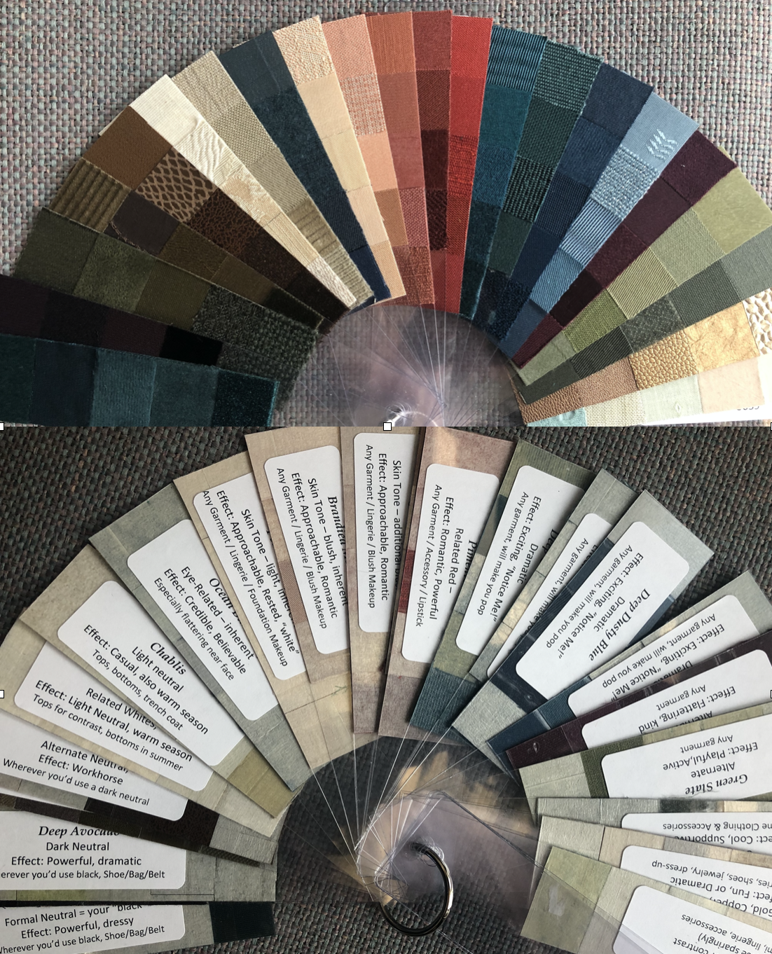
The Dark Neutrals. Starting on the left, all those dark colors are her dark neutrals, starting with the most formal and dramatic. Deep teal and eggplant are her versions of “black” and would be far more smashing as a “little black dress” than black on her. The rich earthy browns and olives (a hallmark of most Autumn palettes, along with rust) are her other dark neutrals, just not as formal. The brown also matches her hair color. The cream stick is her version of white. (Real white is too stark a neutral for her; this shade doesn’t make her teeth look dingy by comparison.) The pale khaki is a more casual neutral and is welcome in the warmer months. Just because a color is called “neutral” doesn’t mean it can’t be smashing.
The “Inherent” Colors When you wear colors that reflect your natural coloring (hair, eyes, teeth, skin) you look most authentic. That gorgeous dark loden blue is her eye color. Wearing your eye color in a top makes you seem especially credible, because the viewer unconsciously looks for color repetition and hence is drawn to your eyes. The next two colors are skin tones (undertones and blush) and make you look “human” and approachable. Getting the inherent colors right is crucial because they’re the basis for the rest of the palette. Additionally the inherent colors focus the viewer’s eye on the face, which is where we connect best (unless you want the focus on your body, like if you were a model or trolling for a hot date).
The Reds send messages of power and/or romance. Everyone gets some kind of red–warmer or cooler, brighter or softer. The wrong red can be painfully unflattering.
Dramatic hues. For this client the dramatics play around with brighter versions of her eye color and the dark eggplant. These colors make her skin and eyes glow. People notice when she wears these!
Subtle hues. On the far right the yellow-green and sage are softly flattering and less “look at me.”
Metals. In this fan her metals range from warm gold to bronze. Metals are not just about jewelry; they make great belts, purses, and shoes. Or for a festive look, as metallic threads in fabric or knits.
Pastels. The rightmost stick basically takes the other sticks down to their very palest tone. They can be used as other versions of “white.”
More about using Black and White. If you missed the two pieces I wrote awhile back, they are here: When to wear black; when to wear white.
Want to see pictures of other Autumn palettes, people and clothes? I’ve got a Pinterest board just for you.
Better yet, do you want a custom color palette of your very own? Let me know!